
Candlestick charts are a type of price chart and are commonly used in technical analysis. Candlestick charts show the open, closing, high, and low prices of a specific asset within a chosen period of time.
Candlesticks were initially used in the Japanese rice market by merchants and became popular in the US afterward.
In this article, we will explain the basics of candlestick charts and learn about the components of a candlestick. At the end of this article, you will also learn the difference between a candlestick chart and a bar chart.
Simply put, a candlestick chart is a representation of price movements in a specific period of time. This price chart is mainly used by traders and investors in their technical analysis.
The chart consists of candlesticks that show the high, low, open, and closing prices for the selected time period, e.g. 4-hour or daily.
Over time, these candlesticks can form patterns, known as candlestick patterns.
By reading candlestick charts, traders try to find these patterns which will then help them in predicting the price direction of their chosen asset.
Candlesticks can be used in the technical analysis of any assets that have a relatively liquid market such as stocks, Forex, commodities, or cryptocurrencies.
Dating back to the 1700s, candlestick charts were first used by rice merchants in Japan.
It is believed that the first candlestick chart is created by Munehisa Homma, a prominent rice trader at that time.
Homma had his own network of people to get the market prices of rice as fast as possible and create his candlestick charts based on them.
Homma realized that market prices are driven by two forces: market sentiment and the supply and demand within the market.
Later on, it was Steve Nison who introduced the western world to candlestick charts.
Through his book “Japanese Candlestick Charting Techniques”, which was published in 1991, Nison covered all aspects of candlestick charts in detail.
A candlestick consists of a body and two wicks or shadows.
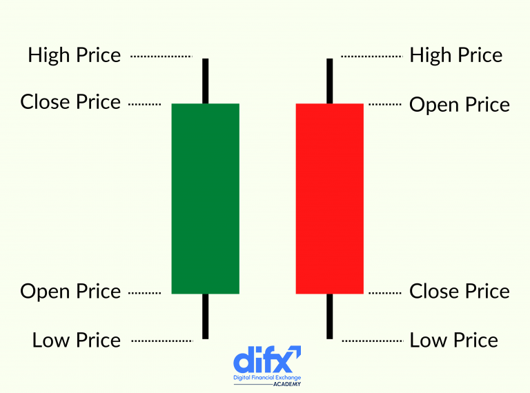
The body is the main part of a candlestick which can be either red or green.
If the body is green, it means that the opening price of the asset was lower than the closing price. In other words, the price of the asset has increased in the given period of time.
On the other hand, If the body is red, it means that the opening price of the asset was higher than its closing price. To put it simply, the price of the asset has decreased in the given time period.
The size of the body can tell us about the intensity of the trading activity within that session.
If the body is long, buyers and sellers were trying intensely to take control of the markets. On the flip side, a short body shows us very limited buying or selling activity.
Therefore, a long-red candlestick indicates strong selling pressure within markets because the closing price is much lower than the opening price.
Similarly, a long-green candlestick shows us strong buying pressure as the closing price is way higher than the opening one.
The candlestick shadows or wicks show the highest or lowest prices in that session. For example, the upper wick of a single candlestick on a 4-hour chart shows the highest price that the asset managed to reach within that 4-hour session.
On the other hand, the lower wick of a candlestick on a 4-hour chart displays the lowest price the asset fell to in that 4-hour session.
Traders can also get information about the markets based on the size of the wicks.
For instance, if a candle stick has a short upper shadow, it means that buyers didn’t bid the price much higher than the opening price. In other words, they were not that strong during that session.
Wicks are also used in recognizing different chart patterns.
A Doji pattern, for example, is formed when the opening and closing prices of a session are quite the same. This will create a candlestick with long wicks and a small or non-existent body.
Doji shows a market condition in which buyers and sellers have the same power over the market or are uncertain about the direction they need to take.
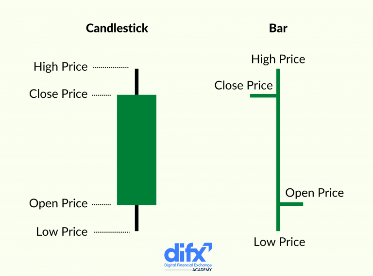
Bar charts and candlestick charts are quite similar. We can receive the same information from both charts, however, they have different ways of presenting it.
As you can see in the image, bar charts consist of vertical lines that can be red or green based on the opening and closing prices. The opening and closing prices are shown by two horizontal lines on the main vertical line.
Candlesticks, on the other hand, give us the same data but they show the opening and closing prices on the upper side and lower side of their body.